We were very excited when OASPA (Open Access Scholarly Publishing Association) approached us for a complete transformation of their digital presence. As a leading Nottingham rebranding agency focusing on sustainable web design, Studio Seventeen worked with OASPA, a global community committed to making open access the default model for scholarly publishing. OASPA represents a diverse network of members who are leaders in open access publishing practices.
Together, we partnered with OASPA to modernise their website and visual identity to better reflect their authority, values, and growing global reach. Our challenge was to create a cohesive, future-proof brand that could scale across platforms, speak to an academic and professional audience, and feel both accessible and inspiring.
Evaluating the Old Site and Branding
OASPA’s previous website, as shown via the Internet Archive, had served its purpose, but was showing its age:
- Complex Navigation: Users faced difficulties finding key resources due to an overly complex menu structure and outdated UI.
- Visual Clutter: Dense blocks of unstyled text, low visual hierarchy, and dated layouts made it hard for visitors to engage.
- Outdated Branding: The logo and design lacked consistency and did not reflect the professionalism or scale of OASPA’s impact.

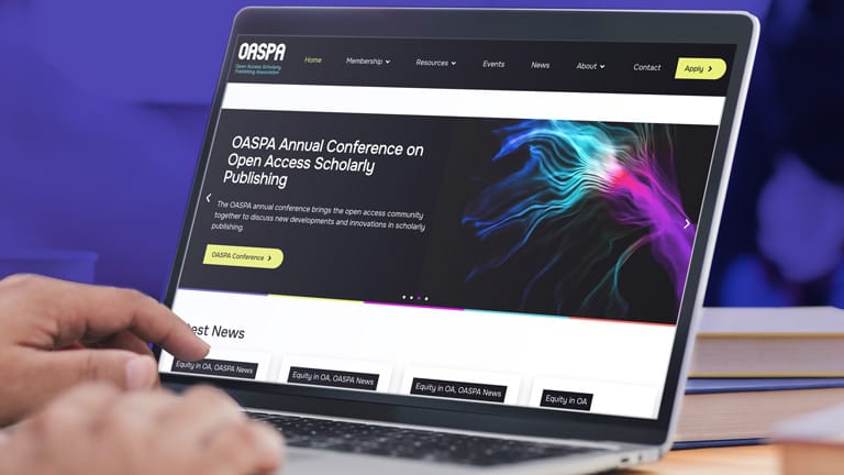
Our Vision: The Future of Open Access
For the full rebrand process, we closely audited and analysed their goals, working with the OASPA team to establish what they felt they needed for scalability moving forwards, and what was currently holding them back. We presented three creative directions and worked closely with the OASPA team to refine the chosen route: “The Future of Open Access.”
This concept was rooted in diversity, accessibility, and forward-thinking design, communicated through layered visuals, a bold new colour system, and modern typographic clarity. From the start, we aligned with their mission to open up knowledge and wanted every element of the brand to feel fresh, inclusive, and confidently professional.

Key Changes in Branding
- Logo Refinement: We simplified and balanced the logo to ensure scalability, visual clarity, and consistency across digital and print formats.
- Visual Language: We built a new design system including accessible colour palettes, open-source typography, abstract logo-derived shapes, and purposeful use of space.
- Colour & Typography: We introduced OASPA’s bold new palette, with fully-accessible contrast guidance, and a highly legible typeface that made reading lengthy blocks of text and information easy.
- Dynamic Visual Elements: The identity system included modular patterns, cutout imagery, and visual motifs designed for maximum flexibility across all touchpoints.


![]()
Impact of the Rebrand
The rebrand has successfully repositioned OASPA as a forward-thinking, digitally confident organisation. Stakeholders, members, and new visitors alike have praised the improved user experience, visual clarity, and contemporary tone. We received great feedback as a result:
Visually the work Studio Seventeen did for us showcases the talent and creativity they have – it’s a fantastic looking website which has not only given us a fresh, modern and professional focal point, it also has much improved functionality, making our resources easy to find. Behind the scenes the team also delivered to a high standard, taking the time to understand what we do and our needs, and making sure every detail has been attended to. They provide first class ongoing support and we wouldn’t hesitate to use them for our future projects. Thanks Gareth and team!Claire Redhead, Executive Director, OASPA
The refreshed brand system, combining polished typography, dynamic colour, and flexible design components, now empowers OASPA to communicate more effectively with its global audience. This project is a powerful example of how a strategic, creative and accessible rebrand can elevate an organisation’s credibility, clarity, and connection with its community. We are incredibly proud of our work with OASPA and look forward to continuing this collaboration as they continue to grow and expand their services.